i4cp — Research, presentations & brand
One visual language,
from insight to impact.
Brand direction, presentation systems and research communication for the Institute for Corporate Productivity, an HR research organization.
- Role
- Visual Design Lead
- Engagement
- In-house, full-time
- Dates
- October 2022–Present
- Focus
- Brand guidelines, presentation templates, research reports, events
The challenge
i4cp’s work moves between detailed research reports, sales conversations, social posts and a conference stage. Each piece has to feel like the same organization — and still do its own job.
My contribution
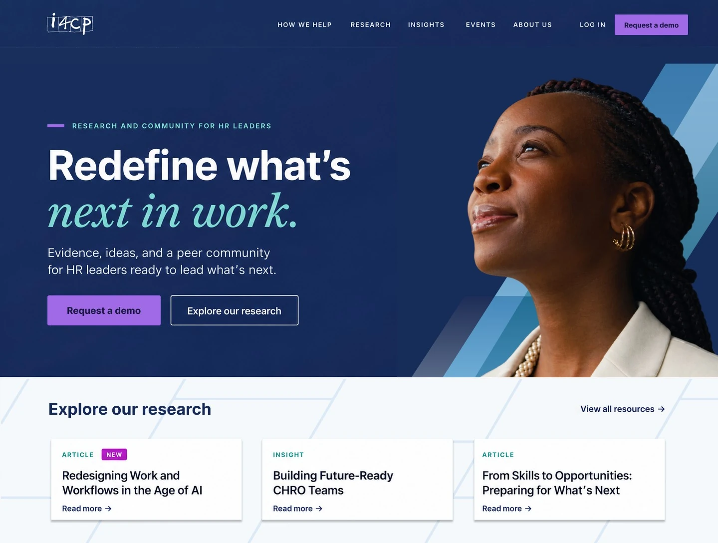
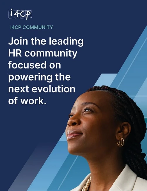
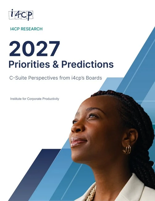
I design across research, marketing, sales, events and executive communication. For the proposed 2027 refresh I’m the lead designer, aligned with general direction from Neubrand: portrait photography, a navy foundation, a more expressive type hierarchy and layered angles drawn from the “4” in i4cp.
The 2027 brand and website applications are upcoming design directions, not a completed launch. Research findings shown are i4cp’s content; my contribution is the design and visual communication.
A recognizable angle
The angle becomes a repeatable device that links the mark, photography and layout across every 2027 application.
Research, ready to read
Editorial design for Three Levels of Skills Maturity, from the cover to the opening research narrative.
Complex ideas, clearly structured
Two slides from a discovery and solution-alignment deck: one makes a relationship visible, the other makes a comparison easy to read.
A visual identity in motion
Stage motion for the 2027 Next Practices Now conference: a blue and green ribbon moves beneath the fixed event title, keeping it legible while adding energy.
This film couldn’t play here. Open the film file (MP4, with sound).
A campaign with a consistent voice
The Confidence Gap series uses the same navy field, gold emphasis and source strip for a report launch, a research finding and a leadership quote.